Creating a peaceful atmosphere in your home often starts with the colors you choose for your walls and décor. Calm colors can help reduce stress, promote relaxation, and make your space feel more inviting. Whether you’re redecorating a single room or refreshing your entire home, selecting the right hues is essential for achieving a soothing environment. In this post, we’ll explore practical tips for choosing calm colors that suit your style and needs.
Why Choose Calm Colors for Your Home?
Colors influence mood and energy. Bright or intense colors like red and orange tend to stimulate, while softer tones like blues, greens, and neutrals encourage relaxation. Incorporating calm colors in your living space can help:
– Reduce feelings of stress and anxiety
– Improve concentration and mental clarity
– Promote restful sleep in bedrooms
– Foster a welcoming environment for family and guests
Now, let’s dive into how you can pick calm colors that work best for your home.
Understand the Psychology of Calming Colors
Before choosing specific shades, it’s helpful to understand what makes colors calming:
Blues
Blue is often considered the most tranquil color. It evokes the sky and ocean, bringing a sense of peace and stability. Light blues work well in bedrooms and bathrooms to create a spa-like ambience.
Greens
Green connects us to nature and has soothing effects. It symbolizes renewal and growth, making it a great choice for living rooms or workspaces where calmness and focus are desired.
Neutrals
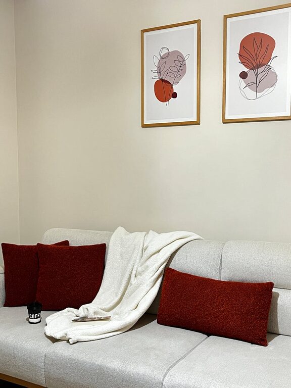
Soft neutrals like beige, taupe, and warm greys provide a gentle background that doesn’t overwhelm the senses. These shades offer flexibility and pair easily with other colors.
Lavender and Soft Purples
These colors add a subtle touch of elegance while promoting relaxation. They’re ideal for bedrooms or cozy reading nooks.
Tips for Choosing the Right Calm Colors
1. Consider the Room’s Purpose
Think about how the room is used. Bedrooms benefit from calming blues or lavenders, while a living room might feel cozy with soft greens or warm neutrals. A home office could use muted blues or greens to encourage focus.
2. Test Colors in Different Lighting
Natural and artificial light can change how a color looks on your walls. Paint small test sections and observe the color at various times of day to ensure it remains soothing in all lighting.
3. Use Soft, Muted Shades
Avoid overly bright or saturated tones if you want calmness. Muted pastels and light hues tend to feel more restful. For example, opt for a pale sage instead of a bright green.
4. Create Color Harmony
Choose colors that complement each other to keep the space balanced. For example, pair a soft blue wall with neutral furniture for a harmonious look.
5. Add Texture and Layers
Calm color doesn’t mean boring. Use textures like soft fabrics, natural wood, or woven rugs to add interest and warmth without sacrificing tranquility.
6. Incorporate Nature Elements
Complement calm colors with natural elements like plants, stone, or wood. These work well with green and neutral tones to enhance the peaceful vibe.
Common Calm Color Palettes to Consider
Here are some popular calm color combinations you might like:
– Pale Blue + White + Warm Beige: Classic and fresh, perfect for coastal-inspired rooms.
– Soft Green + Light Grey + Natural Wood: A nature-inspired palette that feels fresh and grounded.
– Lavender + Soft White + Pale Grey: A delicate mix suitable for restful bedrooms or reading spaces.
– Warm Taupe + Cream + Muted Blue: Elegant and inviting, great for living or dining rooms.
Avoiding Common Mistakes
When selecting calm colors, keep an eye on these pitfalls:
– Choosing colors that feel cold or sterile: Some blues or greys can feel too clinical. Balance them with warm neutrals or textures.
– Overwhelming the room with too many colors: Stick to a limited palette to keep the calm effect.
– Ignoring personal preferences: While trends help, your comfort matters most. Pick colors that make you feel peaceful.
Final Thoughts
Choosing calm colors is a wonderful way to create a tranquil home environment. By understanding color psychology, considering your room’s purpose, testing shades, and layering textures, you’ll design spaces that nurture relaxation and happiness. Remember, calm color selection is an opportunity to express your style while fostering a peaceful atmosphere everyone can enjoy.
Happy decorating!